I am a part of a course-collaboration with DreamWorks Animation Studios, under the mentor-ship of CG Supervisor Dave Walvoord and texturing artist Megan Walker. I am one of the four members of our team, which includes Abhishek Singh, Anushka Deedwania and Timmy Chiu. Our task is to create a photo-realistic environment that tells a story without using any character.
We started with a story of a Japanese Archaeologist, who discovers a gauntlet at an excursion site, and eventually a ninja infiltrates into the archaeologist's office to retrieve the mysterious artifact. The idea was to showcase the aftermath of the fight between the archaeologist and the ninja when they have exited the facility.
I created the layout of the room in 3D, along with modeling the placeholders for the assets, to convey how we wanted the room to look like. Also, I animated the camera and the shuriken as part of the process. We chose to go with two shots, and this is how they looked like:
Previs, Shot 1: Shuriken thrown by the Ninja hitting the bulletin board, on the blue print of the artifact that the archaeologist has found.
Previs, Shot 2: Showing the work-space of the archaeologist along with a hint of the condition of the room after the fight.
We presented our idea and concept to our mentors. Our idea did not appeal them very much. Dave was very confused by the story, and he said there was too much going on in the scene. Also, the major question was that why was this story set in Japan, there was no relevance provided. We decided to change our concept.
Trying to simplify the story and to still have visually-appealing environment, after spending an entire day coming up with a concept, we decided to tell the story of a dad and a son living in Japan. Dad, a retired legendary baseball player, sacrificed his career to take care of his 6 years-old son, Hikari. The son looks up to his dad and wants to follow his footsteps. Our environment has an aesthetic of Wabi Sabi, which means "beauty in imperfection." The scene is set to convey a little bit of father's past and focuses on conveying the caring relationship of the father and the sun.
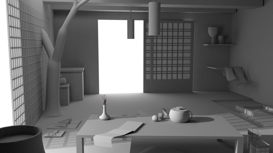
I created a 3D layout of the scene to convey how we wanted the space to look like, and also modeled the placeholders for the elements that are going to be there in our scene. Here is how the space looks like:
Dave and Megan really liked our new concept, its story-telling aspect and the emotions it conveyed. We got a lot of feedback on camera and layout, but were given a green flag to take this concept forward. With every feedback, we iterated and improved the layout of our room and put in a rough key-to-fill ratio.
While looking for references, we came across the illustrations by Pascal Campion, and instantly liked the style of them. We thought the warmth in the lighting and color and the voumetrics will help us tell our story way more interestingly. Therefore, we decided to take that as our base reference for lighting.
My job this week as a team member was to create the base file for the scene, and scale everything in proportion.
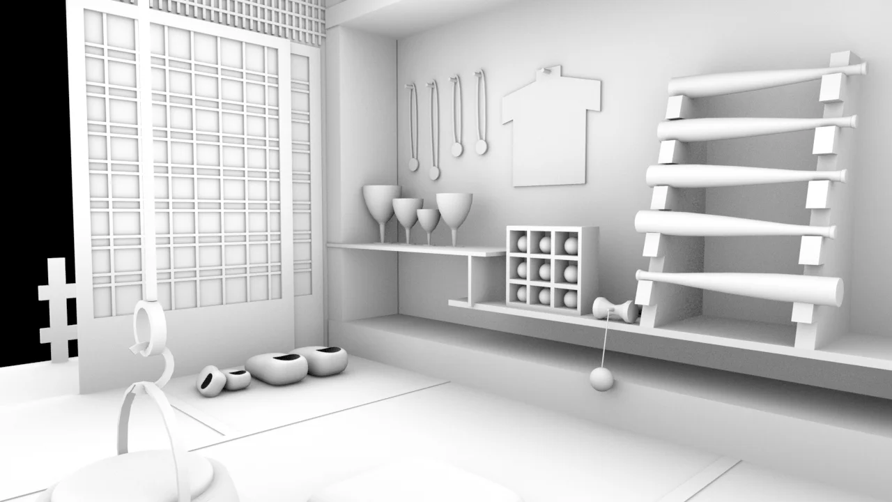
Once we had the layout locked, and we decided on what our hero assets will be, we started modeling. Our hero assets included Baseball gloves, one big and one small, to convey the story of a father and the son. Similarly, we had two pairs of shoes, and two pairs of caps. In addition, we had trophies, showing father's achievement from the past, and of course the baseball and bat.
We divided the modeling, and I was responsible for modeling the caps, trophies and the medals. I completed the first trophy, which was very simple pedestal with baseball bats, and a baseball kept on top. I also started the first trophy and blocking out the cap.
Although we started modeling, we still were getting feedback on our camera-movements and deciding on how many shots should we have to tell the story efficiently.
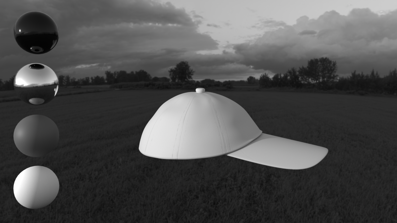
In addition, we setup a visual-development rig with neutral lighting for our models and shader turntables.
We also built our VDev Rig in class. We were fortunate to get the shaders for the reference spheres from Megan. I think that was a big privilige.
Icontinued modeling the trophies. I finished two trophies, and I am working on another IBAF trophy.
The hat model is also close to completion at this point. I am testing out how displacement and normal maps will work in Maya.
We also experimented with some light moods. I did the daylight variations while Timmy did the night/moonlight ones.
In Week 5, we were assigned to create 12 shaders as a team by Dave and Megan. We decided that we will each do 12 shaders and then choose 2 best of each material to show to Dave and Megan. Below are the 9 shaders that I created.
Also, the cap displacement when imported into Maya was missing a lot of details. So I am trying to figure out how to bake as much detail as possible into the displacement map from ZBrush.
I figured out the displacement on the cap, the big factor was the scale. In Zbrush, under ZPlugin Menu > MultiMap Exporter, the displacement has "Get Scale" option, which worked like magic, and I also increased the DPSubPix to get more accurate cavity displacements.
Here is the difference between the displacement maps before and after using the "Get Scale" and increasing the Displacement SubPixels
I achieved the finer wrinkles and stitches using normal map.
After I had baked as much detail as I could into displacement and normal maps and had it working in Maya, I started shading the cap.
I am also modeling the medals on the side.
Megan said the stitches were too big on the cap and that it looked too simple. So I reduced the size of the stitches and made the fabric of the cap dirty. She asked me to put some sweat and dirt marks and grunge on the texture.
I also shaded the trophy this week.
Megan liked the grunge on the cap and the scale of the stitches. However, she asked me to push the grunge more and also to make the direction of the weave consistent so it all going upwards and meeting at the top rather than going in random directions.
Also, in an email conversation with Dave about color palette, he liked the color of walls to be purple, and noticed that it also went well with the purple hat. So he suggested switching the color of the hats. (Initially we decided to have child's hat purple and dad's hat green based on WabiSabi color palette.) So, I switched the colors of the hats.
I am also working on hero-lighting for third shot, the shadows are too dark, and the father's mitt is barely visible. So, I am working on making the shadows less dense and positioning it in a way that all our hero assets are in focus. Below are the different iterations I went through before reaching a satisfactory lighting. The first image is what the shot looked liked before hero lighting and the last image is my final iteration. I learned how very subtle lighting change can bring out a major change in the look and focus of the shot.
I completed modeling and shading the medals.
I also applied shaders and basic textures to the books. We used our previs models for the books since they are not very close to camera and hence not in focus.
We thought of adding dynamic elements to our scene to give it life. Animating the book pages and moving the bushes that were in the exterior were our options. I started with testing the book pages animation. I used Maya's nCloth to achieve the wind effect.
The book pages flipping looked distracting in the scene. We wanted the focus to got to our hero elements and with the pages flipping, book was taking all the focus. I tried lowering the wind amount, but since book pages were the only thing moving, they were still distracting. So we decided not to move the pages. However, ended up replacing the old book model with the model that was result of the simulation.
The last week was finalizing, compositing, Ambient Occlusion and Depth of Field. I was responsible for the title slate, credits and the sound.
For the sound, Professor Bridget suggested adding a commentary of a baseball game, suggesting that the fatherand son are watching a baseball game together, so I started with a blend of the commentary and Japanese music. Later, we debated if we need the music, and I eventually ended up adding just the birds chirping with the sound of the baseball game.


