Week 2: Pre-visualisation: Set Dressing, Camera and Light
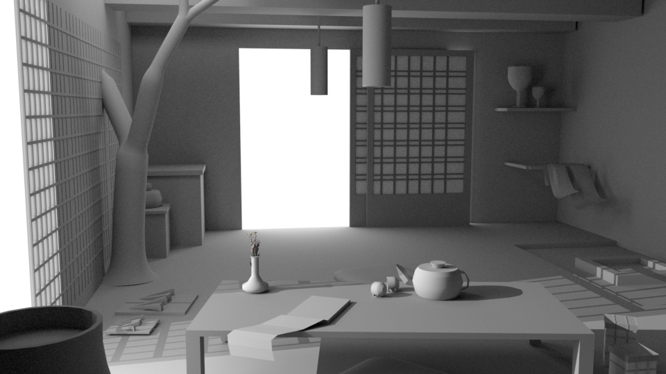
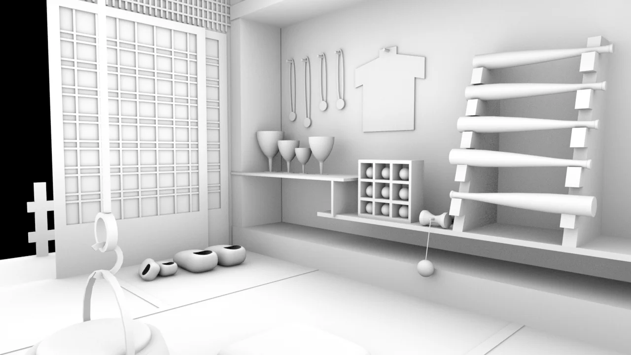
Dave and Megan really liked our new concept, its story-telling aspect and the emotions it conveyed. We got a lot of feedback on camera and layout, but were given a green flag to take this concept forward. With every feedback, we iterated and improved the layout of our room and put in a rough key-to-fill ratio.
While looking for references, we came across the illustrations by Pascal Campion, and instantly liked the style of them. We thought the warmth in the lighting and color and the voumetrics will help us tell our story way more interestingly. Therefore, we decided to take that as our base reference for lighting.
My job this week as a team member was to create the base file for the scene, and scale everything in proportion.


